
Team: 1 Visual Designer/ researcher, 2 UXD/ researcher
Role: User Experience Designer, User Experience Researcher
Year: 2018
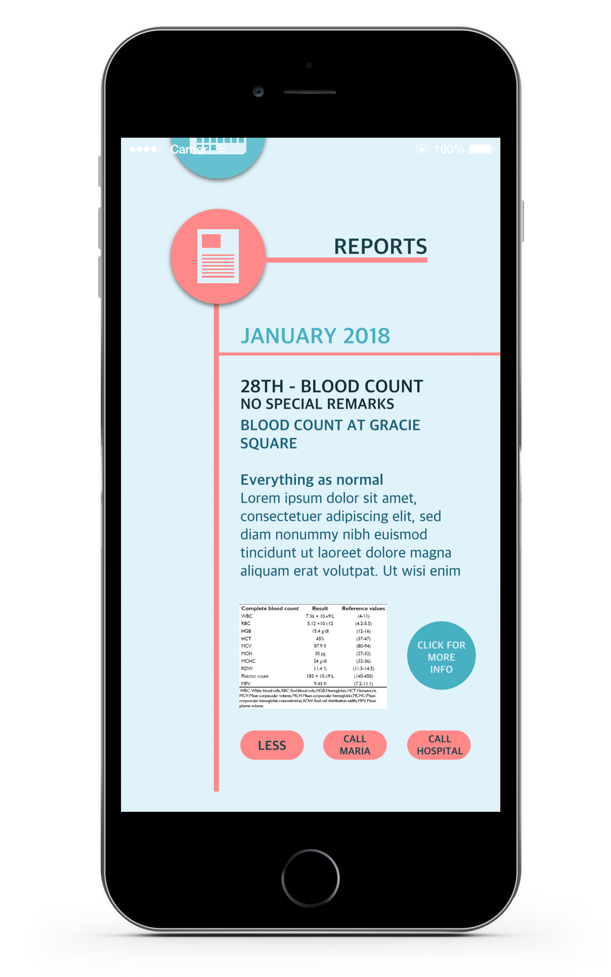
Dr.Link is an app that prioritizes practicality and functionality to provide the best for all of its users. It allows the hospital to share data about the patient’s medication, appointments, and medical reports to both the senior and their family members in an accessible and efficient manner. Different users will have different interfaces to better suit their needs, for example, the seniors’ interface would priorities readability and simplicity, while the family member’s side would prioritize efficiency.
Problem
As the age of technology emerges, it brings forth a lot of convenience to our lives, but it can also make other lives more complicated. A lot of seniors struggle with using new technologies, and would rather use traditional ways such as memory and note taking to remind themselves of important things like medication intake and doctor appointments, and this may not always be the most reliable way.
Proposed solution
Dr. Link was designed in a group project with intentions to simplify and make communication between the elder user, their family members, and their health provider more efficient. Its primary purpose is to organize information that may be hard to find or understand (eg. health records, clinical reports) into digestible bits for both the elder and their family. We focus on designing interfaces that encourages both parties to facilitate more conversation and information sharing, while also designing for a more accessible, convenient platform for elders.
User Research
Research shows that seniors prefer high contrast graphics, which enables them to easily read and recognize things. As iconography on digital media is a rather new culture, it is better to provide text on top of icons. Capitalized san-serif fonts with thick, even strokes are also preferred as they have higher visibility compared to serifs with uneven strokes. There is also room in the market for more voice designed products. This is interesting to our project because it is definitely something we could explore given that our primary users are elders that may not be as sensitive to visual languages as younger generations are.
As for the caretaker side, we understand that they are familiar with technologies and smartphones, therefore knows how to navigate through a more minimalistic interface featuring icons instead of words. This leads to a clean and sleek design for the caretaker interface to promote efficiency.
User Scenarios
Nikolas Spalding is a 75 year old diabetes patient that lives with his spouse in Brooklyn. Spalding’s daughter, Maria, usually visits them once per week, but due to the increased workload she can barely make enough time to visit and take care of her parents.
During a regulatory checkup visit to the hospital, the staff told Maria that she can download the app “Dr.Link” for Spalding and herself, which can provide both parties information on medication and reports, along with future scheduling. Maria downloads the app for her parents and herself, and made sure that it’s connected with the hospital during setup.
Despite Maria’s busy schedule, she is able to keep track of her father’s medication intake and medical reports. She is also able to remind her father to eat medicine as the app notifies both the daughter and the elder before and after the medication intake time.
Iteration 1 | Wires


User Flow
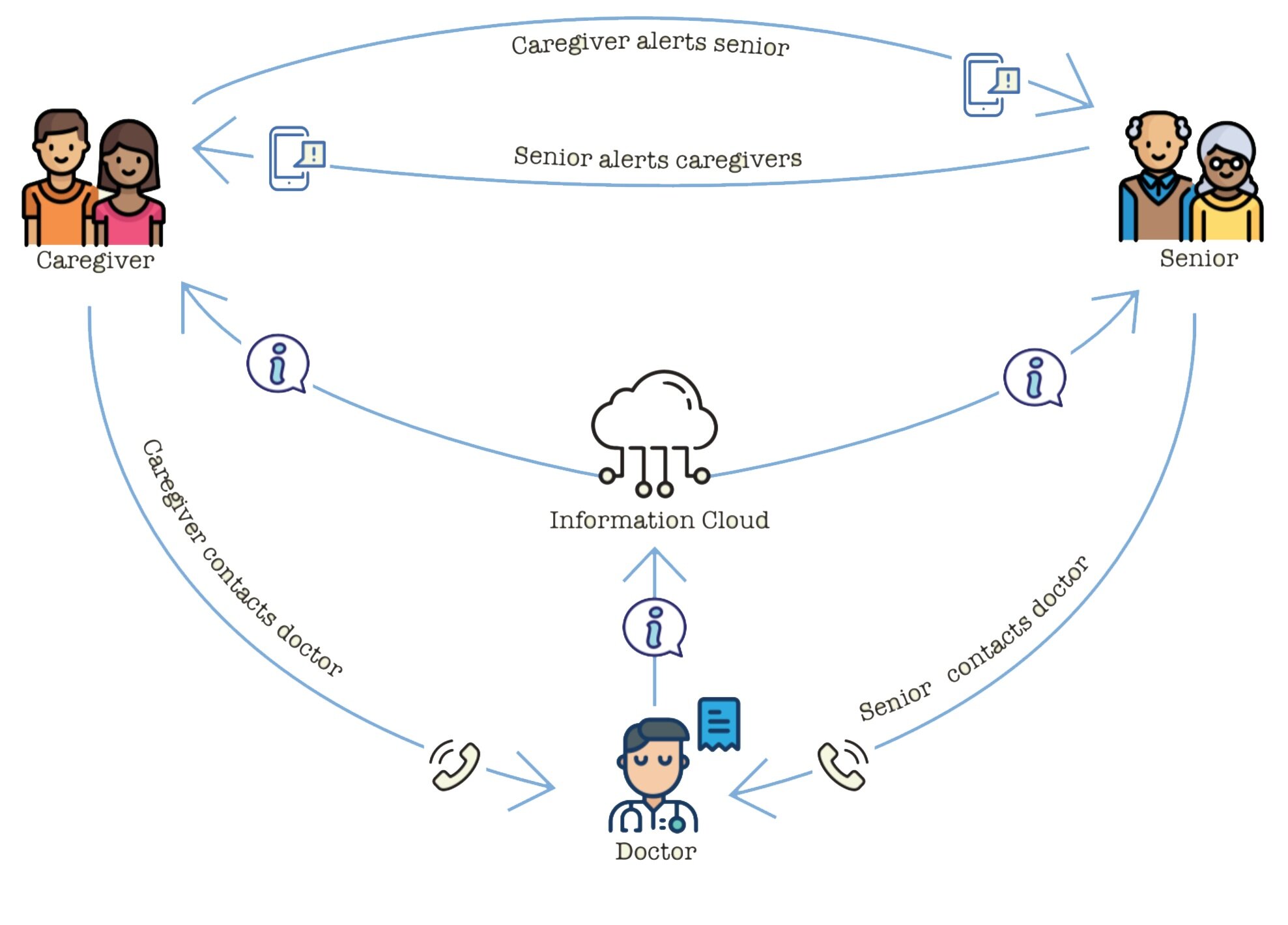
This user flow of Dr. Link is meant to illustrate where Dr.Link may fit within the daily use of all three parties: The Doctor, patient, and caretaker. A caretaker may receive notifications from the patient letting them know of any updates. A caretaker may also push reminders to patients. A patient may contact a doctor or hospital facility confirming appointments, updating on any possible cancellations or delays to appointments.
Flow
iPad model for Elder


Mobile View

User testing
Our prototype was tested on people whose age ranged from 16-66. Most of the people enjoyed the interface and agreed with the concept. One observation noted was that the older the person, the more comments they gave. Family members were impressed with the concept and understood the concept as they reflected on their own family members aging. One person suggested integrating Dr. Link with more applications. Another person wanted more information on the elder — and suggested location tracker along with biofeedback from a Fitbit or other device.
Tony, 44
Wanted to have more control
See location & activity of elderly
Thinks it works for elderly to enter their own information
Should see option for who you are monitoring
Wants to send reminder
Grandma, 66
“Red is a good color”
Fonts are easy to see
Clear distinctions between contents
Thinks she doesn't need help
Did not understand any of the icons used
Don't use acronyms or shortened words
Peter, 16
“Too simple”
“Icons are clear”
Doesn’t think it requires additional function
Sandra, 24
Sees good in simplicity
Doesn’t think too much communication from the Dr. is necessary
Only wants click interactions
Wants to see option to cancel appointment
Usertesting II
We made an appointment to visit Senior Planet, a local institution that teaches seniors how to use technology. It was the perfect opportunity for us to user test as the demographics fit our product well. We received feedback from the seniors like comments on visual changes, navigations, adaptability, and accessibility. Overall it was a well received project and we were able to collect more advice and comments to prepare for our final product. We carefully noted all of the comments and even questions that the participants had to improve out design.